Canyon
Canyon is the biggest D2C, e-commerce-only bicycle brand in the world. Selling complex, physical products in a digital environment, the online shop substitutes trust and information for direct experience.
As the Lead UI Designer, I've directed my team and stakeholders while overseeing development. I took responsibility for the appearance of the business's only sales channel, shaping every touchpoint in the user journey from discovery to purchase.
User centricity
Canyon serves users quietly and without excess, accessible across platforms. User-centricity is not seen as a slogan, but as a discipline on par with mountain biking or road cycling.
Through extensive data and continuous, iterative usability testing, every touchpoint is designed around the user's decision-making process, surfacing the right information at the right moment.

Design system
A systematic approach lays the foundation for functional and visual unity, meeting WCAG standards. A large number of components scale and adapt organically in a dynamic environment.
Canyon's design system gives the online shop a deliberate, professional feel that gives users confidence and builds trust in the digital realm.
Audience
Canyon caters to a target audience ranging from daily commuters to amateur cyclists and professional athletes across all ages and backgrounds.
Besides bikes, Canyon offers a broad product portfolio comprising gear, spare parts and apparel. Delivering across all continents, the online shop serves the needs of a diverse user group.
Information architecture
A coherent, uncluttered navigation guides users through a wide range of products, helping them complete their tasks quickly and with minimal friction.
Set against a fast-paced sports industry, driven by daily releases and linked to a steady stream of social media campaigns, Canyon's reduced interface stays free of decoration and focused on the essentials to guide users intuitively.
Customization
In an increasingly saturated market, Canyon's customization programme is key to leveraging the bikes' core performance differences and users' brand loyalty.
Through the online configurator, the user experience becomes a creative process, enabling users to configure their bike to their individual preferences.
HqO – Office App
HqO’s Office App provides landlords and tenants with a digital platform for building future-proof, people-focused work environments.
Office employees of any professional background are the app's user personas, who use it to configure their workplace, organise their day, sync with colleagues, and more.

Design system
A constantly evolving library of components, from granular elements to complex modules, supports the application's broad range of use cases.
Every element is guided by a principle of restraint: nothing superfluous, as clarity is favoured over ornament so usability can speak for itself.
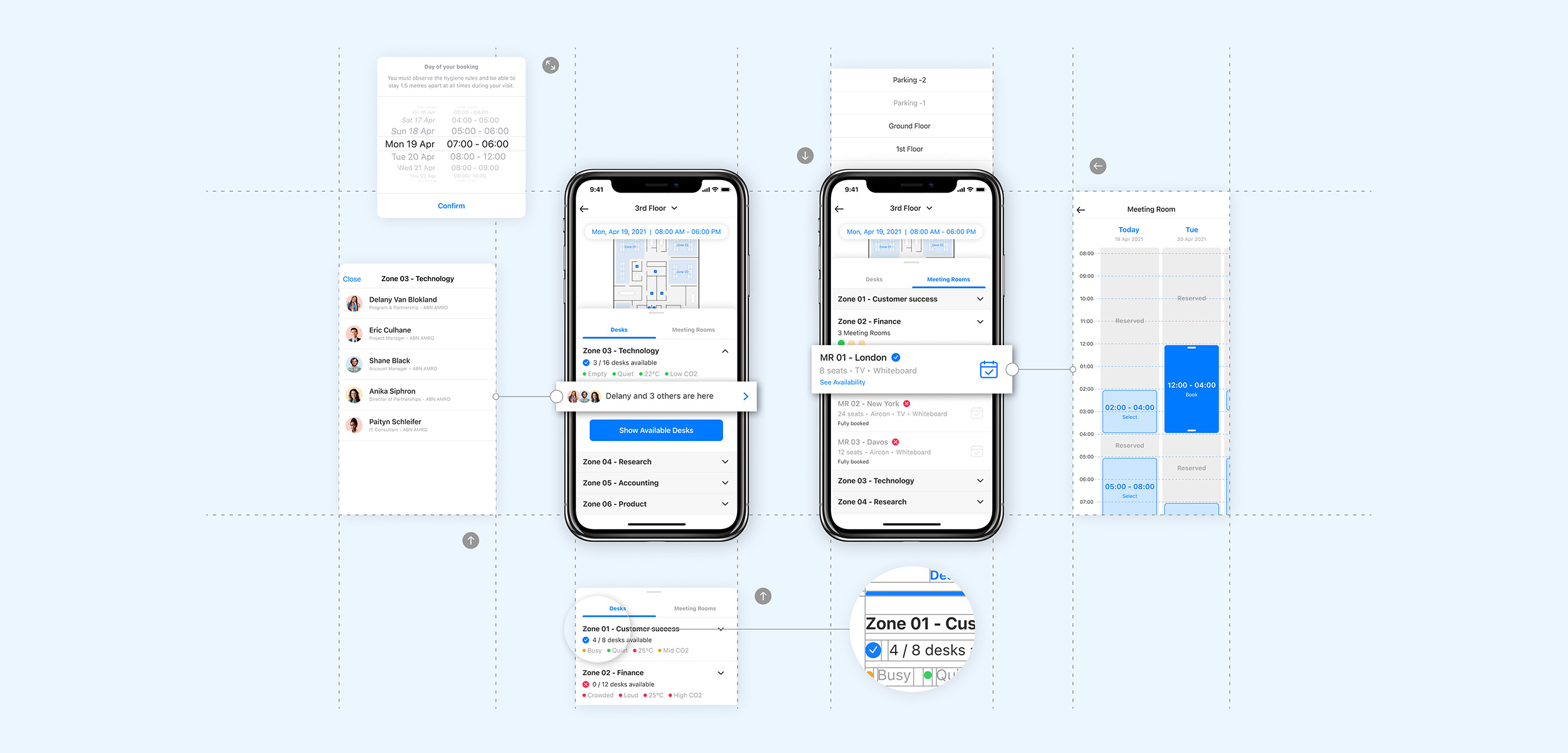
User experience
Employees are guided through a seamless, end-to-end experience, from planning meetings to booking workplaces that suit their preferences.
Every interaction feeds into a data-informed picture, giving landlords deeper visibility into how spaces are actually used.

Personalisation
Office App gathers a wide range of custom-built functions and integrations in one cohesive ecosystem.
Tailored to individual routines, this user-centred approach turns everyday logistics into a frictionless experience.

Evolving user needs
New standards of work have shifted the office from a fixed destination to a flexible resource, where real-time helps to reduce friction and streamline daily coordination.
Office app adapts and unifies fragmented tasks into one seamless point of access to the physical and digital workplace.

Claimlane
Claimlane is a system designed to automate and accelerate the process of submitting returns. Customer satisfaction increases, while the workload for retailers and suppliers is reduced.
In one flow, multiple retailers and suppliers can be involved, with Claimlane surfacing insights on quality standards and helping identify potential manufacturing defects.
Self-service & interface
Through self-service functionality, customers can easily submit and document complaints, uploading photos and evidence directly within the flow.
Claimlane serves customer service teams' need to automate tasks and deliver fast, accurate resolutions, presenting a clean-cut, neutral interface that stays out of the way of the fashion brands it hosts.
User guidance
Every request is guided step by step, prompting customers for the right information upfront so agents receive complete, verified cases rather than back-and-forth emails.
This structured intake reduces ambiguity for the user while giving service teams a consistent, reliable foundation to act on.
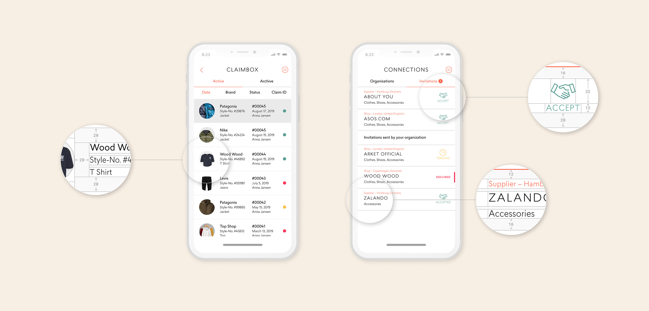
Streamlined workflow
The user experience resembles a direct exchange between customer and retailer, allowing complaints to be forwarded immediately to individual suppliers.
Claimlane's goal is to gain full control of the claims process, minimise errors, and significantly reduce time spent on each complaint.
Scope & flexibility
Beyond returns, the same interface accommodates warranty claims, repairs, and spare-part requests, adapting to each case type without asking users to learn a new flow.
This consistency lets the product scale across a wide range of use cases while keeping the experience familiar and predictable.


NU.nl – Annotators
Today, news agencies that used to report on complex controversies often end up in bitter debates regarding their framing, rather than the facts. Feverish concern for truth disables authors and readers from agreeing on what is correct.
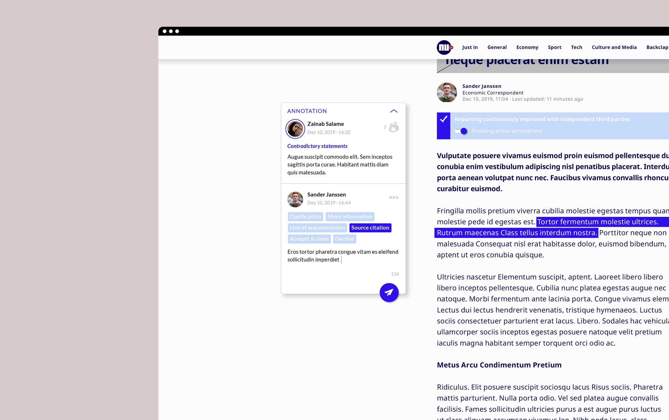
To prevent the two sides from drifting apart, NU.nl formed a community of knowledgeable annotators who use a transparent tool that promotes sensible annotations rather than opinionated comments.
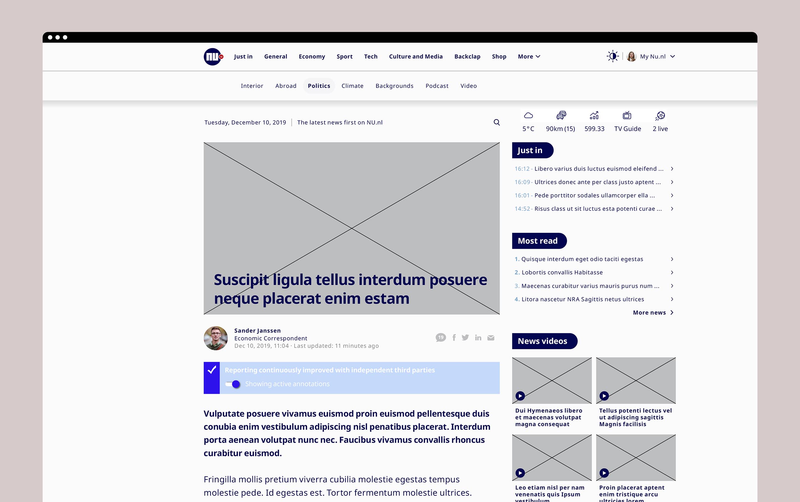
Annotation system
Readers submit annotations directly within the article, highlighting specific claims or framing choices worth scrutiny through a lightweight, in-context interaction.
A vetted community of knowledgeable annotators then reviews each submission, contributing context and source-based reasoning through a structured, user-centred workflow rather than open-ended opinion.
Transparency & trust
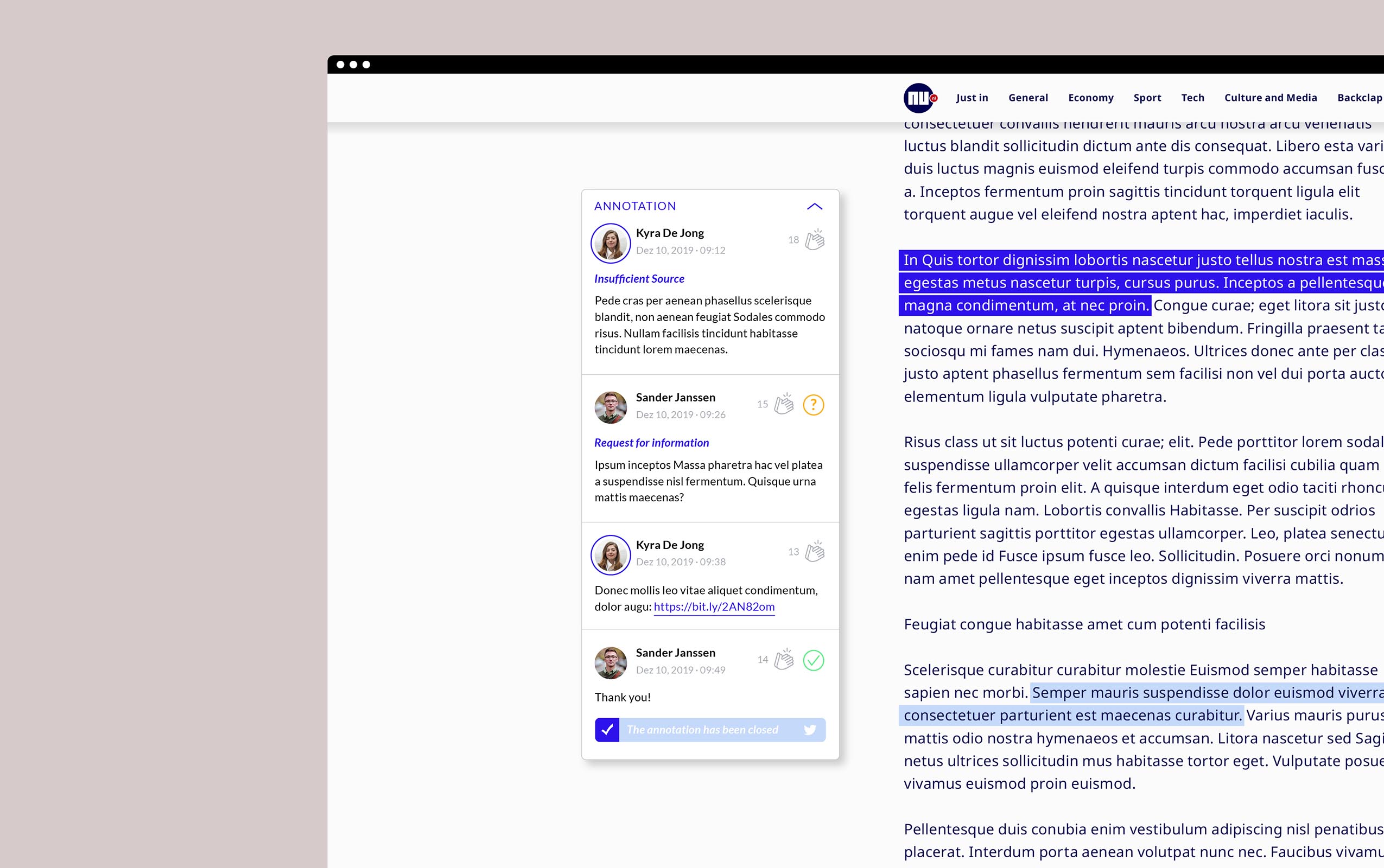
Every annotation appears alongside the article in a clear, unobtrusive layer, with its reasoning and sources exposed for readers to trace and evaluate.
This transparent, evidence-first design shifts the experience from taking sides to examining facts, rebuilding a shared, trustworthy foundation between newsroom and audience.

Scalable system
Built as a reusable framework rather than a one-off feature, the annotation system can be easily extended to other newsrooms facing similar challenges. Its modular, platform-agnostic design offers a blueprint for the wider news industry to adopt.
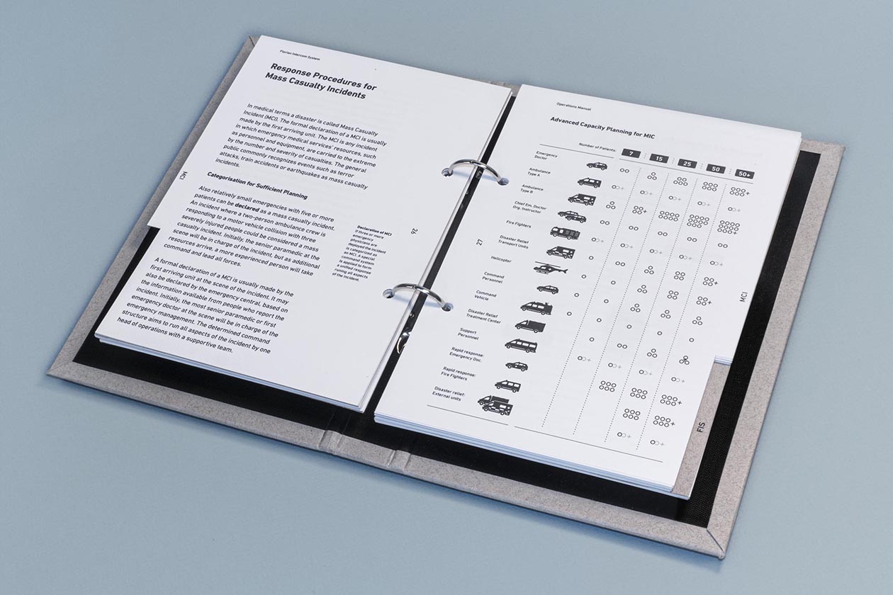
Florian Intercom System
During a Mass Casualty Incident, the exchange of information becomes essential for people's health. However, dramatic events continuously reveal that Emergency Services' tools lag behind today's technological standards.
Conducted in collaboration with the Emergency Medical Services (EMS) Nordrhein-Westfalen, Germany, this case study aimed to close the gap in the EMS's communication systems.

Problem statement: Technological gap
Spanning almost a decade, the 2017 Grenfell Tower Fire and the 2010 Duisburg Love Parade Stampede serve as case studies illustrating today's problems in EMS communication.
Both events left people dead and injured, as faulty communication led to a slow, deficient emergency response, demonstrating the need for a digital solution that channels patients' registration and monitoring in real time.

Digital triage
At the core of every emergency response sits triage: the allocation of treatment according to a system of priorities.
The app's primary focus is to digitally represent events on the ground, document the analogue triage, and serve to coordinate multiple relief forces in real time.

Stakeholder alignment
Various problems were structured from a user perspective and translated into a clear research approach that engaged stakeholders across disciplines.
Physicians, paramedics, and firefighters were aligned through interviews and later usability testing to surface knowledge gaps, needs, and goals.


User journey
Investigating the course of events localised the relief forces' plan of action and visualised their procedures, revealing usability and communication issues not visible in quantitative data alone.
These insights were translated into clearer user flows, improving how users interact with each other and the product to create an intuitive, user-centred solution.
User journey
Investigating the course of events localised the relief forces' plan of action and visualised their procedures, revealing usability and communication issues not visible in quantitative data alone.
These insights were translated into clearer user flows, improving how users interact with each other and the product to create an intuitive, user-centred solution.
These insights were translated into clearer user flows, improving how users interact with each other and the product to create an intuitive, user-centred solution.


User profiles
As users' environments and the scope of application became apparent, design and functionality were developed accordingly, creating alignment across relief forces.
Beyond triage, the Florian Intercom System supports communication between users and provides data to train relief forces for future incidents.